
Creating a website is easy.
Creating a good website is hard.
There are so many things which – if you get them wrong – can destroy all your good work in other areas.
Here’s a list of website fails – with examples which all come from my personal experience. (None of them are clients, thank goodness!)
Have a read. Have a laugh. Then have a think about your website. If it has any of these problems, fix it now! (If you need help to fix it, just get in touch.)
1. Have no images on your website
Back when the internet started, it was text-only. No websites had images. But things have moved on. Mostly.
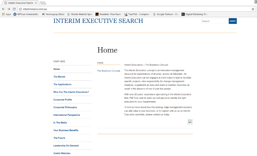
We’re no longer in the 20th century. This screenshot is from April 2017!
2. Too many, too big or just the wrong images will make your website fail.
How many images is too many?
That depends what you’re doing. If you’re in e-commerce, photography, architecture or building, you can have lots of images. As long as they’re relevant. But for most of us selling services, there is a limit.
Images draw attention, but too many images visible at the same time can be distracting. People don’t know where to look or what matters.
What’s wrong with big images?
In this context, I’m not talking about the size of the image on the screen, I’m talking about the amount of data the image uses.
Think of it as the difference between how big you look and how heavy you are. Your dimensions and your weight.
A kite might be really big, but it’s still easy for the wind to lift. A brick, on the other hand, can be much smaller but it’s hard to budge. Because it has weight. Internet ‘weight’ is measured in bytes (or kilobytes, or megabytes) of data. And heavy images are hard to move around. So they slow sites down.
Hint: use TinyPNG to compress your images without losing quality. That’s like shaving off the fat but leaving the muscle you need to do the work.
[Update October 2018: If you’re using bigger images, a helpful reader suggested this tool as an alternative. It handles images up to 50MB each!!]
What about the wrong images?
 Ones which mean nothing to your target audience.
Ones which don’t present you the way you want to be seen. (Quite apart from the creative, would you trust a company which can’t spell to design your logo? Their attention to detail seems lacking…)
Clearly these don’t help your cause.
If you want to know more, there’s a post here about using the right images on your website.
3. Have a long load time.
People get bored easily. Especially online.
Try loading the Chicago Tribune. See how long it takes. I used 3 different tests (all free online) to measure the speed, and here’s what I got.
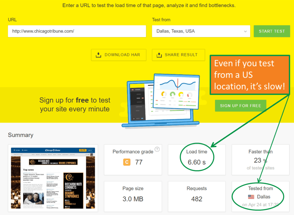
The quickest test results shows it took over 6 seconds to load. And that’s based on testing from within the US.
The next test shows a load time of nearly 8 seconds – and that’s till document completion – that is, until it looks like a web page. Other components of the page – ad pixels, tracking scripts and so one – take another 10 seconds. Which makes me wonder what the point of those scripts is – who would still be on that page?
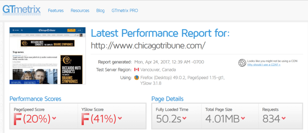
And here’s the worst of the lot – a full load time of 50 seconds!
Why does load time matter? Because it annoys visitors and that affects how they interact with your site.
- The Telegraph tested slower loading pages:
- a 4 second delay meant 11% fewer page views.
- a 20 second delay meant 44% fewer page views
- AliExpress reduced load time for their pages by 36% and saw:
- a 10.5% increase in orders
- a 27% increase in conversion rates for new customers.
Obviously not every site can be the fastest on the web, but you don’t want to be the slowest!
4. Have confusing navigation on your website
Remember that website with no images? It has poor navigation too.
When you click on one of those menu options on the left, here’s what you get. Where did the main menu go?
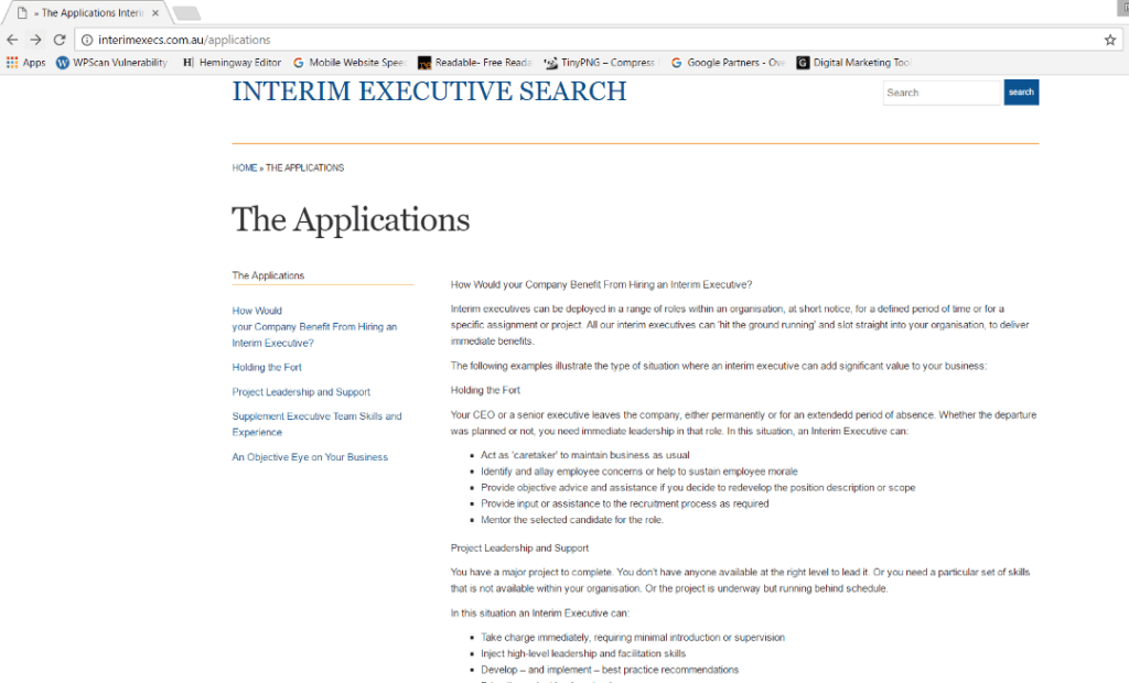
How are you meant to get to other pages you might want to visit? What if you read all about the benefits of interim executives and decide you’d like to hire one? How do you contact this company to help you do it? As far as I can tell, your only option is to go back to the home page and start again. That’s not exactly user-friendly!
So that’s an obvious website fail.
Alfred Sung is a more attractive website at first glance, but has the same navigation problem. Top level menu options disappear. They may do it more stylishly, but they still disappear. (Unless you look at it on a mobile, funnily enough.)
5. Make sure your site doesn’t work on a mobile
Because in 2016, mobile internet traffic overtook desktop traffic.
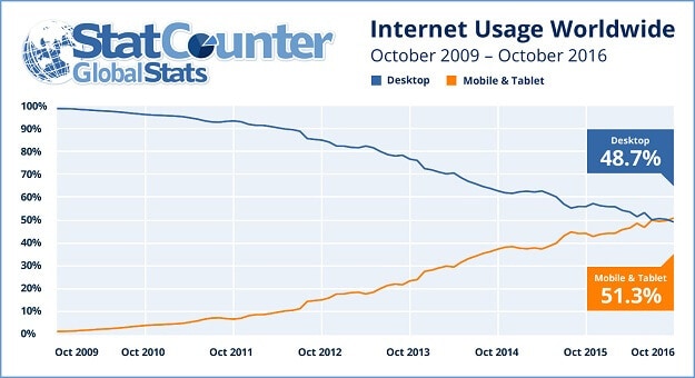
So if you want your website to look better than this one, you need to make sure it’s ‘responsive’.

Poor project management can also make your website fail.
All websites need redesigning and relaunching every so often. At its simplest, this is like redecorating a room. More often, it’s more like a renovation. New spaces and rooms are like new pages and sections. Items (content)
may be thrown out or relocated.
It’s never as easy as you think it’s going to be.
I’ve worked with a number of businesses on website redesigns. In some cases, I’ve been brought in when projects are part completed and not on track.
- Set a deadline for the new site to be live, but not set any milestones along the way to that deadline. Then take 3 weeks to review and respond to initial design.
- Agree to a limited redesign – the home page and 3 pages for 3 specific customer personas. Then change the scope to a complete website redesign – but refuse to extend the timeline for the project.
- Agree to a website redesign in order to implement specific features (mobile-friendly, CMS, add a blog etc), without considering the overall purpose of the website, for visitors and for the company itself.
- Provide a list of keywords which the site should be optimised for – after the new website has rolled out.
- Adding a blog or news section without considering who will be responsible for adding content after rollout.
- Changing to a new CMS (content management system, used to update and maintain the website), but not train anyone on how to use it.
It’s even worse when the client has an internal IT team who control the back end of the website.
- Not implementing redirects from urls which were no longer in use.
Links on the new site had all been tested, so they all worked. But no one ever knows all every single link from other sites – and they don’t change. That’s why you need to set up redirects.
In this case, without redirects, anyone who clicked on outdated external links got a 404 ‘not found’ error page. The worst of these was a change in url from companydomain.com/contact-us to companydomain.com/contact. So links to the contact page simply didn’t work! - Taking a website live before the agreed time. Without telling us.
Yes, really! We were still updating content when the site was rolled live. So we had to roll out all over again anyway. But this did affect relationships!
None of these projects were easy. Most of them took longer than initially planned. One of them broke a client relationship beyond repair. On the plus side, all of them were educational. Everyone makes mistakes – but at least we can learn from them. So we don’t make the same mistake the next time around.
Here’s hoping you learn from some of these stories rather than from your own website fails!


