I’m a big believer in marketing data.
That’s data about your customers. Data about your market. Data about your campaigns and activities.
But marketing data is only the start. It’s how well you understand and use it that makes the difference.
What does that mean in real life? All sorts of things, but today I want to look at trends, blips and statistical significance.
Business moves fast these days. There’s a lot of pressure to make a decision. To act. We turn to the data for help. We want data. We leap on it. We don’t always examine it, let alone understand it. And that can lead to terrible mistakes.
Here’s my point:
Sometimes there’s not enough data to support a decision. It may be better to wait.
It’s not so much of a problem for corporates and multinationals. But if you’re a local business, or in a niche market with limited customers and prospects, you might find it happens.
Let me use some examples to illustrate.
The difference between a trend and a blip – and why it matters
A trend is an ongoing pattern in data. Most commonly it’s a pattern over time. It could also be a pattern over geographic location, or age, or gender, but the commonest of all is time.
Here’s my first real-life example.
The graph below shows click data for an Adwords account from mid-2013 to now. The monthly number of clicks bumps along until April 2015. Then in May 2015 it suddenly triples. Monthly clicks continue to grow overall, right up to January 2016. There’s a growth trend.
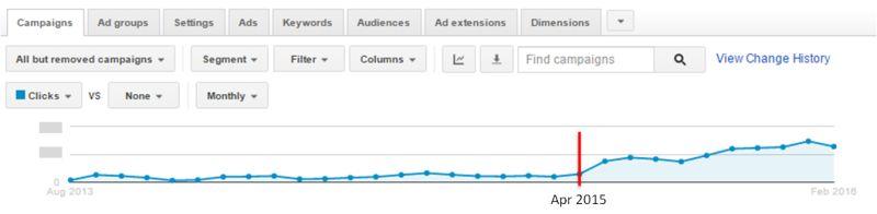
In this case, the data reflects changes made to the Adwords account. I implemented a new, more targeted campaign in May 2015. Then when this started to get results, I went on refining it over time. Getting more clicks. Hence the growth trend.
Now look at July and August 2015. They show fewer clicks than June 2015. Yet by September, clicks are on the rise again. Those lower results were just a blip.
What about February 2016? It’s a drop from January. Is it a blip, or the start of a trend? That’s the million dollar question. Because if it’s just a blip, there’s no need to worry. But if it’s a trend, it’s not a good one. And we need to do something about it.
I think it’s a blip. The client had some website issues in February. Ads were clicking through to a non-existent page, so they got disapproved. But there were also major changes to Google’s Adwords display in mid- February. So for now the only thing to do is monitor.
Which brings me to my next point.
You can’t have a trend unless you have enough data.
Many small to medium businesses in Australia have quite small target markets. That’s especially true if you provide a niche service, or only serve a specific geographic area. What that means is that campaigns are relatively small. So the dataset is relatively small. You may need to run campaigns for a longer time to get enough data to be meaningful. (Which is a problem, of course. People want quick results!)
Here’s my second example.
I was on the phone to Google, getting help with an account problem. The problem was fixed easily, then the rep offered to look at my account and see if he could make any suggestions. I’ll always take free advice and a chance to learn. So I said yes.
And here’s the data he navigated me to.
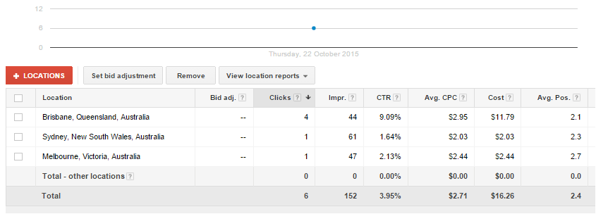
Based on this, he suggested, ‘Why don’t you consider cutting Sydney and focusing on Brisbane, where you’re getting much better results?‘
I nearly exploded!
The entire data set was only 152 impressions. One day’s traffic. How could he base a decision on so little data?
I talked him into looking at impressions for the entire month.
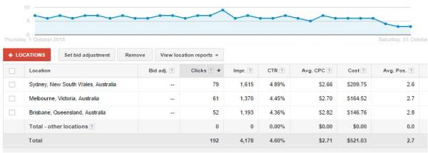
The data set is now over 4000 impressions. Big enough to mean something statistically. To have trends.
As you can see, Sydney now has the most clicks, the best clickthrough rate and the lowest cost-per-click. Look over a two month period, same thing. The specific values are slightly different, but Sydney consistently scores better. What’s more, this client is in Sydney. Not only do Sydney click convert to leads at a higher rate, those leads are easier to follow up with.
To be fair to Mr Google Rep, he didn’t know where the client was based. And when we looked at more data, he immediately withdrew his suggestion. Plus, he fixed my immediate issue easily – he certainly knew his way around Adwords. He just didn’t think about the validity of the dataset he was looking at.
It’s scary though. I wonder how many callers would challenge the Google ‘expert’ on the other end of the phone?
How do you know you have enough marketing data for a meaningful trend?
For clients with niche targeting, this can be a challenge. You want to be sure any trend is ‘statistically significant’. I studied statistics at school and I think it’s something to do with the standard deviation, but I’m not sure. So I use a simple rule of thumb. Try some ‘what if‘ tests on key measures and see what happens.
Here’s one last Adwords example.
But to shake things up a teeny bit, this is about ad copy rather than total clicks.
We’re going to look at the ads for one particular ad group for one particular client.
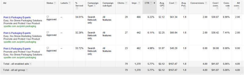
What can we see from the data here?
1. All the ads are very similar.
That’s because we are trying to optimise this particular ad. It beat some other ads in earlier tests. Once we have an optimised version, we’ll test that version against some other completely different ads.
2. The data set has 1370 impressions, spread pretty evenly across all the ad options.
That’s good. It’s enough data for a trend to show up.
3. The bottom ad is underperforming.
Significantly.
- Lowest number of clicks.
- Lowest clickthrough rate.
- Most significant of all, no conversions.
Interesting that just switching the last two lines of an ad can make such a difference. But that’s what testing is about. And the test shows it’s time to dump this ad.
4. What about the middle ad? Should we dump that too?
Compared to the top ad, it has fewer clicks and a lower clickthrough rate. The same number of conversions. This is the grey area.
Is the difference statistically significant?
Here’s where I do my simple ‘what if‘ test. What if this ad had got one more click?
It would then have 28 clicks from 442 impressions, giving a CTR of 6.33%. More than the ad above it.
If one click can change which ad is better, the variation is not statistically significant. So I wouldn’t (and didn’t!) dump the ad.
The bottom line:
If you don’t have meaningful marketing data, don’t base decisions on it.
One other thing to bear in mind. Somebody else’s data isn’t necessarily meaningful for you and your business.
Best days and times to send email? Are you looking at B2C, B2B or even a specific industry? The answers may differ.
And what do you know about the quality and recency of their data? There’s a great article here about how hard it can be to track down the source of commonly accepted statistics.
Use other people’s data to create a theory, but don’t assume it’s correct. Test it!