
You’ll find plenty of marketing advice telling you not to use stock images – that original content is best. Yet stock image services continue to thrive. The reason is simple – we don’t all have the kind of budgets we’d need to use original images everywhere. So let’s stop pretending and look instead at how to use stock images as effectively as possible.
The first thing to do is set some limits. Whatever your budget, there are some places you shouldn’t use stock images at all.
Where you shouldn’t use a stock image
Does your website have an ‘About’ page? This is where people come to find out more about you and your business. They’re looking for something real. If you use stock images on this page, what will they think? You’ve got something to hide. You’re embarrassed about your business. You’re pretending you have a big office when in fact you’re working from home. None of that helps promote your business!
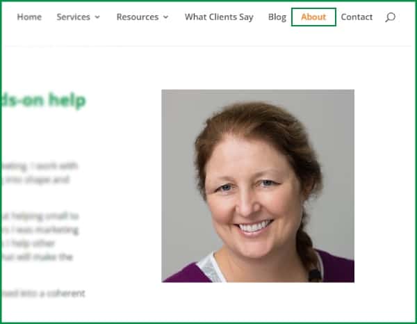
Is personal trust important in your business? (I need to be sure of my accountant, my psychologist, my dentist. I’m less concerned about my greengrocer and I don’t care at all about the person I buy petrol from, even if I’m picky about the brand of petrol.) You need a headshot. You might want it on the home page as well as in the ‘About’ area.
Invest in a professional photo shoot. If you have a team, get them all in for the day and get headshots of everyone. Adding extra people costs very little compared to getting the photographer out there in the first place.
If you have an office or work premises, do the shoot there and get some professional location shots too. Tidy up in advance! If you have vehicles with branding on them, clean those up and include them in the shoot. Your staff can stand next to them; sit in them; take equipment or materials out of the back and so on. The more you get in the shoot, the more cost-effective it is.
Now leverage those photos. Your website. Brochures. Social media pages. Social media posts. Heck, even Christmas cards. Add funny captions. Whack festive hats on everyone’s heads. It’s amazing what you can do with Canva. But real people are real. Prove you’re real.
If you need a good, affordable photographer, check out Cesar at Ocampo Studio. He can do your headshots, as well as product photos and social-media-friendly personal branding packages.
But even if you use him for all of that, you may still need stock images elsewhere. You’ve got all of your website, brochures and social media to fill. How do you make stock images work for you?
How to use stock images when you do use them
1. Think about which stock image services you want to use
There are plenty of stock image libraries. Some are paid services, like Shutterstock, iStock and Adobe Stock. Others are free – Pixabay, Unsplash and Freepik. (Although Unsplash and Freepik also have paid options.)
Why pay if there are free options? There are a few reasons:
- More (and better?) images
The free libraries have lots of food, nature, health and fashion content. They’re less helpful if you’re trying to illustrate a more complex topic. (Try searching on ‘setting priorities’ or ‘overtime’, for example, and you’ll soon understand what I mean.) - More certainty that you’re not infringing copyright
With a solid business model and some income to look after their reputation, paid sites are better set up to monitor and manage whether those uploading images have the rights to them in the first place. - Better search and filter capabilities which save you time.
This last reason is to me the most important one to use. It’s possible to spend hours trawling though stock image libraries trying to find the ideal image for what you want. But as we all know, time is money.
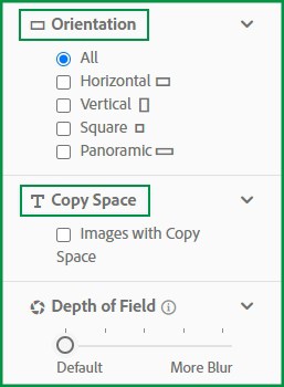
Categorising images is difficult. Paid sites tend to have more keywords and descriptors attached to each image. They also have more filters. Depending on your needs, some or all of the following may be relevant:
- type of image (photo, illustration, vector etc)
- colour (either by primary colour or down to the level of a hex code)
- orientation or shape of image (so you can see ones which will fit in the space you have in mind)
- copy space (ie a blank part of the image where you can add words. Useful for social media in particular.)
There are some additional features in Adobe Stock which in our experience can help get to the right image more quickly. If you find something which is ‘sort of right’ you can quickly look at images from the same series, or images with similar content. It doesn’t always work well, but sometimes it’s fantastic.

Remember, you’re not limited to any one stock image library. We combine Adobe Stock with some of the free ones, especially for social media images. Try a few. See which you like. You could even ‘test-drive’ several against two or three ideas you want to source images for. See which ones have the most matching images; how well they match and how easily you can filter to get to what you want.
2. Avoid the obvious
No website is enhanced by a photo of five or six random business people sitting around a table smiling. What does it mean? It’s filler on the page, with no message beyond the fact that you couldn’t be bothered to take a photo of your own team.
It looks like a stock photo.
The aim is to try and find a stock photo which doesn’t look like a stock photo. Or at the very least, looks like you went to some effort to find a photo which matched your topic.
A non-complete list of kinds of stock image you should avoid:
- business people doing nothing other than smile or look at a computer screen
- stick men and bubble people
- a keyboard and a coffee cup
- people shaking hands
- wordclouds
- fake technocomputer overlays (especially if a businessman in a suit is pressing a button on an invisible wall)


And then there are the very basic analogies which get used all the time:
- jigsaw pieces for teamwork
- chess for strategy
- light bulbs for ideas and inspiration
- a row of growing seedlings and ever larger piles of coins
You may not be able to avoid all of these all the time, but try to. And if you do use them, do something to make them less ‘stock’. (There’s an image of a cup and a pen on our home page. The cup and pen are in NoBull green and there’s a piece of paper which says ‘Worth it!’ So there’s branding and a message.)
3. Beware overused images
Sometimes a particular image or a particular model may become very popular. Many years ago we used a stock photo of a young Indian woman on a flyer. Then I started seeing her everywhere.

Turns out she does a lot of Zoom calls for a lot of people too!
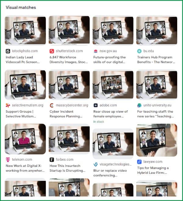
Any human being who sees this person popping up on sites all over the place is going to realise she’s a stock photo model. It may be subconscious, but there’ll be a little bit of something which makes people wonder.
So how do you avoid this happening to you? There’s no surefire way. But you can try:
- Filtering your stock library search results. Adobe Stock has an option for ‘undiscovered content’ – which should eliminate the most popular images. Shutterstock has a ‘usage score’ for each image.
- Neither of these works for the model as opposed to the specific image. You can try using Google image search and see what you find. That’s how we got the images above.
4. Think about the purpose of your image
As a general rule:
- an image in a social media feed is to attract attention
- An image in a blog post is to attract interest and reinforce the message of the post
- an image on a web page or brochure is to make visitors feel warmer and more positive about whatever you are offering
Some tips on images for social media
Social media is also more relaxed overall than your website. Think of it as the difference between meeting someone in the office and catching up for a coffee or drinks. That means you can afford to take a few more risks with images in your social media posts than on your website or other marketing materials. Plus, things disappear down the feed fairly quickly, so even if you make a mistake it’s probably not going to hang around and haunt you. (Unless you make a really big one!)
Try something which looks different but is related to your post content. A few examples:
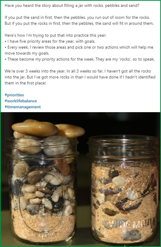
- This jar full of rocks. It illustrates the metaphor, not the lesson. (Start with the important stuff.) It’s fresher that way.
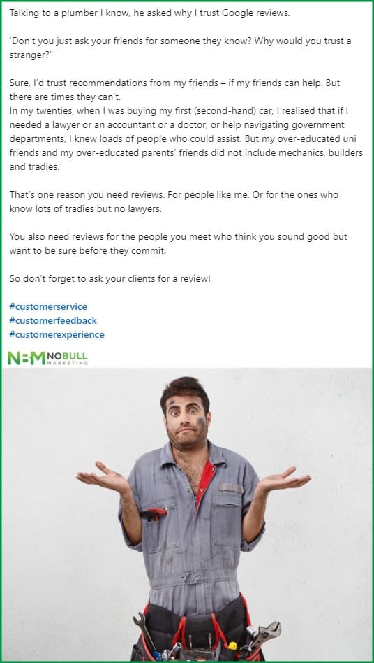
- This post about Google reviews. It ties into the opening line of the story rather than focusing on the point. (Reviews are a good thing to have.)
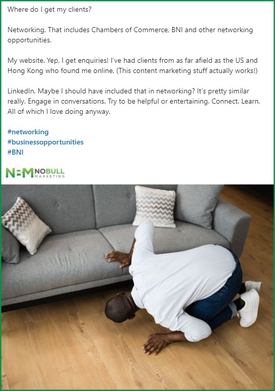
- This one about looking for new clients. It plays on the idea of looking for something, but takes it out of the business context to make it different.
5. Think about the message your image should convey
Images catch the eye. You want to attract attention, but you also have a chance to convey a message or an idea. This is especially relevant for blogs, articles and white papers.
For example, we recently wrote a blog about how to work better with the AV provider at an event. So we wanted an image which promoted the partnership message and also tied back to the theme of events and audiovisual. This is a great example of a ‘complex’ topic or idea with multiple facets to it, as mentioned above.
We searched on all kinds of terms – and combinations of terms. ‘event av’ ‘event av organiser’ ‘event organiser partnership’. We looked at ideas like people performing at an event in a way which depended on each other – trapeze artists, for example. We went back and forth with the client on a few ideas. Then eventually we found this:

Yes, it’s a stock image, but it doesn’t feel like a stock image on the blog. It’s a perfect tie-in to the twin concepts of audio-visual equipment and partnership, which we wanted to get across. Plus it has gentle humour which fits well with the client’s personal brand.
6. Create an image style guide
What unspoken rule or guidelines do you have about the kinds of images that suit your brand?
For example:
- NoBull Marketing blog feature images are always photos. No illustrations. No vectors. No discussion! Just photos. They also always have a touch of our brand colours.
- One client has an all-female office, so she wants images which are predominantly women, to reflect what potential customers can expect if they get in touch.
- Another is a bookkeeper who wants to promote the peace and calm which come from being sure your accounts are correct and up to date. She doesn’t want images about money, she wants images which reflect calm, all in soft brand colours.
- Another works with career-driven people in their 40s or older and wants images of older people, a mix of men and women, but must be happy and positive.
- We worked with a pest controller who only wanted to show the happy result of using his services – no images of cockroaches, termites or other bugs. So a post about ticks had an image of a child and dog playing happily in the grass, free from fear of ticks, not an image of a tick on a dog.
- Are you a natural healer who wants images of nature? Or a cutting edge architect who wants street scenes with chic and style?
- Do you want to show people? We’re naturally attracted to faces, so there’s a good argument to have people in your images. On the other hand, you don’t want boring stock image people!
Once you have clarity about what you want in your images, it’s easier to create consistency, which is part of what you need to build a brand.
You can even set different guidelines for different images. For example, our colour and photo rules are much stricter for the feature images on our website and blog than they are for images within the posts or on social media.
7. Edit images to match your brand colours
I’ve pulled this out of the general style guide because it’s so important, and because there’s more than one way to create that consistent brand colour.
The simple option is to search or filter by colour. Adobe Stock uses an exact hex code filter. I sometimes wonder what we’re missing if we’re that specific, but it’s a great way to narrow down search results. Combine it with ‘find similar’ to get near matches on colour.
Sometimes, a better option is to find an image which matches your message, then edit it to match your brand colours. Your license to a stock image includes the right to edit and amend. (How do you think that cup and pen on our home page got to be in NoBull green?)
You may think this sounds like a lot of work. But if you have the skills, it’s actually a quick job. If you don’t have the skills, and you don’t know a teenager who has them either, find someone on Fiverr. Give them a batch of images at the same time. It will cost far less than custom images and look far more consistent and integrated than simple stock images.
8. Try combining more than one image
The example below is the feature image for our blog post on organic social media versus paid social media. Stock images for ‘social media’ are boring. They’re usually a collection of logos, or some fancy electronic connections between people. We moved away from that towards the ideas in the post. It contrasts paid social media, where you’re bidding for ad space, with organic social media, where you’re building a tribe.

Summing up
Congratulations! You made it to the end of a pretty long post. I hope it’s given you some ideas and inspiration on how to use stock images in a way which builds your brand and showcases individuality.
All the principles here are ones we apply at NoBull Marketing, for our own images and for our clients. We’re not always perfect, but most people will forgive you one or two images which are a bit dull – as long as the rest do something for them.
Oh, one final reminder. This post is all about choosing and using the best image for the job. If you’re working online, remember you also need to optimise your images to get the best value from them. More on that another time.