
You want your website to look good. Scrub that. You want it to look better than good – it should look fantastic. But you also want it to work. Unfortunately, sometimes designers focus on looks more than results. You can end up with web design mistakes which affect performance.
Now, there are all kinds of mistakes to make out there, but the ones which bug me most of all are the ones which affect your website copy.
The words on your website have a job to do. You want them to work hard. As a copywriter, I write words which work hard for you – but sometimes I find my precious words stuck on a site which makes their job more difficult. Here’s my list of things web designers do which I wish they wouldn’t!
1. Huge hero images taking over the home page
Don’t get me wrong, I have no problem with hero images on the home page. I just don’t like it when they take up so much space you have to scroll down to see any copy.
Here’s an example where I say the design is a mistake. This image is actually a video. Click on it to watch the video the whole way through, then tell me what this business does.
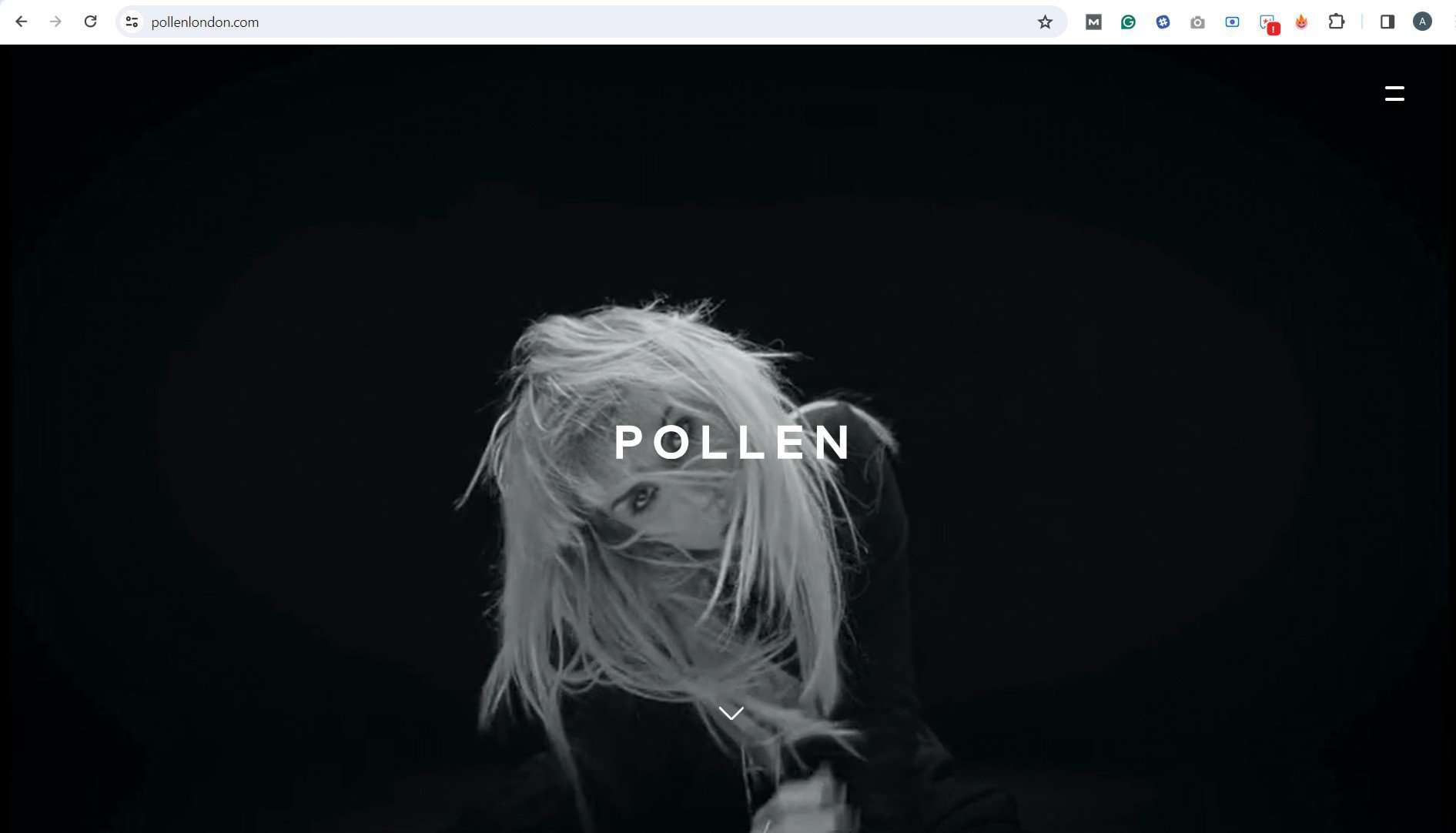
Did you work it out? I couldn’t. I had to scroll down.
This may look great. But it gives me no idea at all about the business. So it misses the mark. There isn’t even a hint from the menu items – they’re all hidden behind a hamburger!
The very first words on your home page are the most important of all. They tell everyone who visits:
- What you do
- Who you do it for
- What they’ll get if they use you
It helps if they’re visible!
Here’s an example of a home page which does it better:
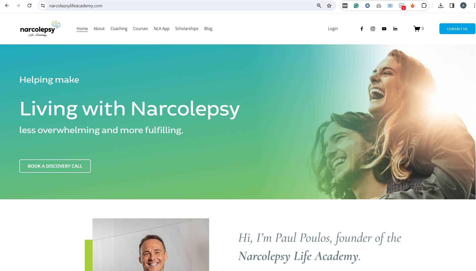
This time, you can see the words and the hero image work together. So you can tell what this business does the minute you land on the website.
2. Centre justifying paragraphs of text
This is one of those web design mistakes which drives me crazy!
It’s easy to think that centre justified text looks more ‘balanced’. In fact, it’s just harder to read.
When you read, your eye travels from left to right along the line of text, then jumps back to start the next line. If the text is left-justified, you know where to jump back to. If the left margin is all over the place (which is what happens with centre-justified text), your eye and brain have to look for the start of each and every line.
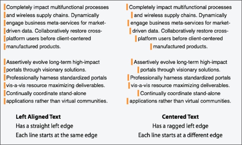
(Image source: https://uxmovement.com/content/why-you-should-never-center-align-paragraph-text/)
Now, this doesn’t matter with headings. With headings, you’re not jumping from line to line.
But once you get beyond two or three lines of text, left justify!
3. Letting lines of text get too long to read comfortably
Just as those ragged left edges are hard work for your eyes, so are very long lines of text. Your eyes have to track far to the left and the right. They’d rather not do it.
Here’s part of a blog post advocating no more than 75 characters per line – yet the bullet point with this information has a total of 294 characters (including spaces) in just two lines!
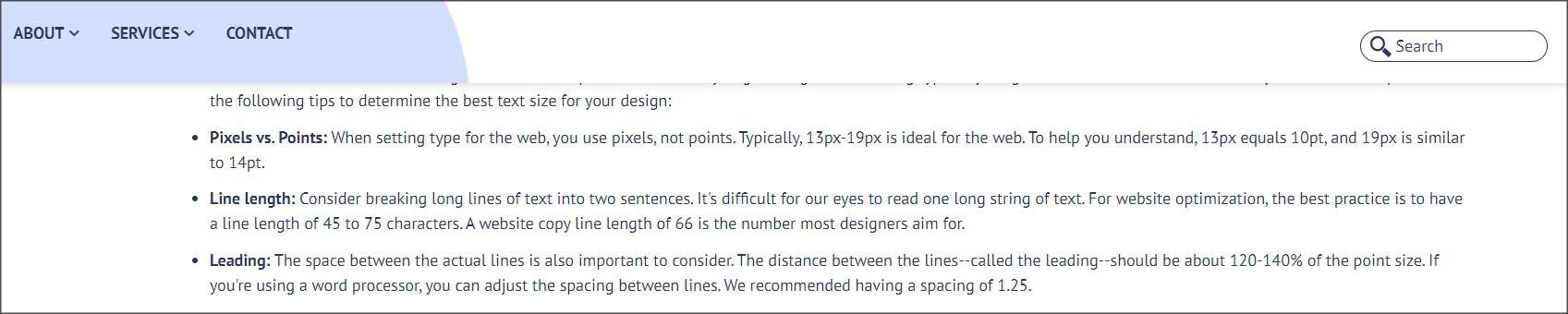
I had to make it small to fit it onto this page. If you can’t read it, this is what it says:
‘Line length: Consider breaking long lines of text into two sentences. It’s difficult for our eyes to read one long string of text. For website optimization, the best practice is to have a line length of 45 to 75 characters. A website copy line length of 66 is the number most designers aim for.’
So in addition to breaking its own advice, this also confuses two completely different things: the length of a line of text, and the length of a sentence. Sigh.
4. Using a tiny font
Half or more of all Australians wear prescription glasses or contact lenses. That means they have some challenges seeing. Why make things hard for them by using tiny font which means they have to squint?
Usability experts recommend a font size of 16 points or more for the main text of a page. Headings, of course, are likely to be even bigger.
Yet we still see pages like this:
5. Using illegible or confusing fonts
Some fonts are easy to read, others not so much.
Thankfully you don’t see many examples where all of the copy is in an unusual and tricky font. But some weird and wonderful fonts crop up in headings.
Script fonts can be difficult. Designers seem to use them on websites for coaches – the aim is probably to make the site seem friendlier and more personal. But you have to be sure your script works for all headings.
For example, this script seems fine.

But the same script works less well here:

Please tell me that you too read that first word as ‘brandy’, just for a moment. I know you’re smart enough to work it out, but you shouldn’t have to work that hard.
Here’s another website, messing with headings in a completely different way:
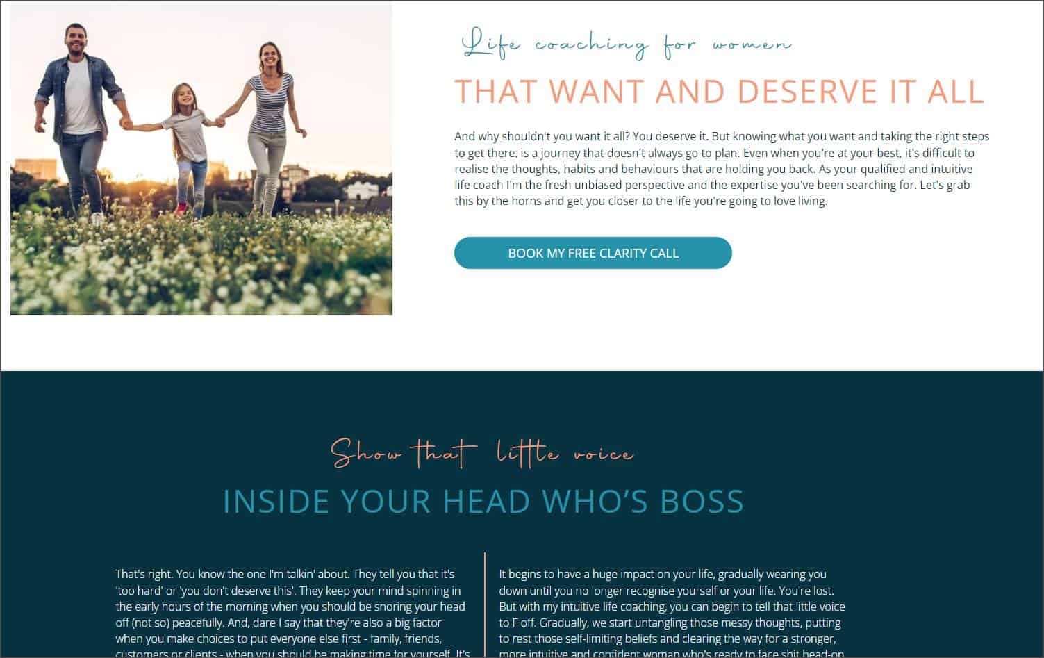
Why have two completely different fonts in the same heading? It simply makes it harder to understand. The visual design takes a single proposition or concept and splits it into two incomplete ones.
You could improve that first heading by changing how the copy is divided between the two fonts.
Life coaching
FOR WOMEN WHO WANT AND DESERVE IT ALL
This allocates a concept to each font: the product is in the script font and the target market is in the capitals. (I also changed ‘that’ to ‘who’ – women are people, not objects, so they deserve a ‘who’!)
But the heading of the second section is harder to resolve. It would need quite some rewriting.
Or you could simply use one font for the entire line and it would work just fine!
6. Using font colours which don’t contrast with the background colour
Contrast makes copy easier to read. Low contrast makes it harder to read. There are actually guidelines to make sites accessible to those with poor site, which include level of contrast. And there plenty of free tools online to check the contrast on your site. The only excuse for web design mistakes like this is when you create your own site and you are untrained.

7. Adding background images which make the font illegible
There’s no point in writing great copy if it’s not even going to be visible!
Half the menu of this home page is missing. It’s white font on a white background. To be fair, they’ve given it a little pale grey outline, so you can just see it, but only just.
There’s actually a call-to-action button on this page. That’s something copywriters put when they want visitors to click. Normally it should stand out – a bright colour or at least one which contrasts with the rest of the page. This one? You have to look hard to find it.
Here’s an even worse example. If I’d spent time crafting the copy which is in white on this page, I’d be really disappointed!

8. Hiding or obscuring links
This issue is less relevant to the copywriter’s goals, but it’s one of the most basic web design mistakes. Sometimes designers make links hard to see.
I have seen websites where you can’t even tell the text is a link unless you hover over it. Think about that. Why would you hover over text just in case it links to something you might be interested in?
This page isn’t quite that bad. The link is a different colour. But it’s only a little bit different. When you hover your mouse over it, an underline appears – and hey presto, the link becomes more obvious.
I’m guessing designers do this so that links don’t interfere with the overall design by grabbing the user’s attention. Only problem is, grabbing attention is usually what a link is meant to do!
9. Last but not least – sliders!
Sliders, or carousels. They used to be beloved of web designers. Now, they’re on the nose.
Why?
Designers eventually realised that hiding content – whether it’s copy or images – is not great for marketing and promoting.
People on your website are impatient. They want what they want, now. They don’t hang around waiting to see what pops up next. (At least, not unless they’ve committed to watch a video, or something like that.)
Sliders aren’t as common at the top of the home page as they used to be. But you still see them lower down (or in the footer) for testimonials. Please, don’t do this. I cannot count the times I’ve been half way through reading a testimonial and the slider whips it away from me! Instead, use big arrows which let the reader control the change. Or just list two or three testimonials underneath each other.
Does your website have these design mistakes?
I’m not a designer. I can’t fix any of these issues for you. All I can do is make you aware of them.
If you created your own website, you now know what to fix. If you have a web designer, it’s time for a chat. Ask why they’ve done it that way. See if they’re open to fixing major issues.
If you’re not getting anywhere, I know a lot of web designers. Ones who don’t make these mistakes. Drop me a line and I’ll introduce you!