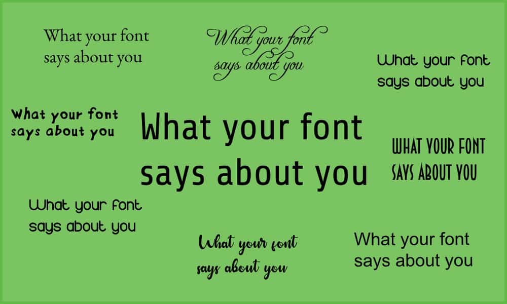
Have you ever thought about how your choice of font affects your marketing?
Many of us only think about fonts in logos. But actually your choice of font affects the appearance of all marketing materials, both online and offline. So it’s worth taking a quick look at the basics of choosing a font.
Font classifications
Let’s start with the basics of how designers categorise fonts.
There are four main categories of font:
- serif
- sans serif
- script
- display
We could go into more detail, but there’s less agreement about sub-classifications. And this top level understanding is really what you need to know when you’re choosing a font. Or several fonts.
Using more than one font
The first thing to be aware of is that you don’t necessarily have to choose just one font. It is in fact very common to have different fonts for headings and for the main body of your text. Why?
- This helps distinguish headings from body text. Even when the fonts are very similar, the subconscious brain notices the difference. It helps to organise the text properly.
- A bit of variety is more interesting and engaging.
- For body text, legibility is a key consideration. There’s a lot of words, so it has to be clean and easy on the eye. Titles and headings, on the other hand, are often shorter and larger. Legibility is still important, but it’s less of a challenge. So there’s more room to play with fonts and create a specific emotion or positioning which suits your brand.
Choosing a font for body text
Serif vs Sans Serif
A ‘serif’ is a little tail in a letter shape. ‘Sans’ means without. So a serif font has little tails on the letters and a sans serif font doesn’t.
Have a look at these fonts and you’ll see the difference.
So which is better? Why would you use one rather than the other?
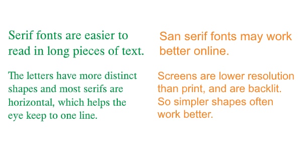
Typographers would say that a serif font is easier to read. The serifs help the letters link to each other and help the eye flow on from one letter to the next.
A sans serif font, on the other hand, has simpler letter shapes. Even high resolution screens have lower resolution than print. The simpler shapes of sans serif fonts often work better online.
As we all spend more time online, there is a general trend toward sans serif fonts, even offline. One result of this is that serif fonts can be seen as traditional, educated and official.
So a simple ‘guideline’ is
- For body text online, use sans serif.
- For body text offline, use serif fonts, especially if you want to appear authoritative.
Of course these guidelines can be broken. It’s up to you and your designer. And even if you follow the guidelines, you still have lots of fonts to choose from. Rounded letters often have a more friendly feel. And specific letters like ‘a’ and ‘g’ can have very different forms, which make a difference to the overall impression of a font.
Let’s take a look at one interesting example
The Google logo
The Google logo has changed several times, but it’s been a wordmark almost from the beginning. That is, the logo is made up of just letters (in this case the company name) and those letters are in a particular font and colour.
The most interesting change was in September 2015, when the Google logo went from serif to sans serif.
![]()
Why did they do that?
It comes back to that point about sans serif shapes being cleaner and displaying well at lower resolutions across all screens – especially mobiles.
Personally, I didn’t like the new logo. I found it too plain and bland, with not much personality. The trademark colours are still unique to Google, but I found the font round, simple and dull. I still do, when I think about it. (But over five years later, I don’t think about it much.)
Let’s look at it another way, though. That plain, round font is childlike, friendly. Non-threatening. Far less sophisticated than the previous design. Set that in the context of increasing concern about powerful technology companies using our data for commercial benefit. Google makes money from the data it collects about everyone who uses its services for free. Google wants those people to trust and like it. Maybe, just maybe, Google wanted a logo which made it look less sophisticated and superior. It wanted to look innocent and childish rather than savvy and smart. And a change of font helped.
Choosing a font for titles and headings
When it comes to logos, titles and headings, legibility is still important. But it’s not as critical. If someone’s only reading a few words, the impact of an unusual font can outweight the effort of deciphering what it says. Communicating brand personality may be as important as legibility.
Your font still has to be legible, but it can also act almost like a picture. It can be more visually striking.
And that’s where the other two categories of fonts come in.
Script fonts
![]()
These are – no surprise! – fonts which look like handwriting. They are usually sans serif.
They are associated with elegance and often luxury. An example of this is the Cadbury logo. Cadbury chocolate might be affordable, but the brand wants to position itself as a little luxurious treat. The rich purple colour helps with this feeling too.
Script fonts also tend to be more personal and friendly, rather than formal and business-like. They can be really effective for developing connection and trust – for example if you’re running a coaching or wellness businesses.
But it’s easier to read the printed word than handwriting! So keep your script font away from long pieces of text. Use it for headings, quotations, testimonials and so on.
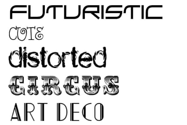
Display Fonts
Display fonts are all about style and impression – about positioning.
There are display fonts for every brand personality. Quirky. Hi-tech. Light-hearted fun. Dramatic. Nature-loving.
Whether you want to use a display font at all depends on your business and your brand. We saw above that Google don’t. Other big companies use display fonts in their logos. Disney. NASA. IBM. CNN. But not on their websites.
One thing to remember is that with display fonts, a little bit can go a long way!
If you’re interested in finding out more about fonts, here are some extra resources.
First, a marvelous Infographic from Crazy Egg:
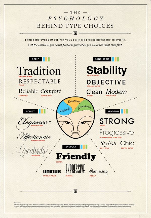
Source: [https://www.crazyegg.com/blog/psychology-of-fonts-infographic/]
Secondly, Typewolf have a number of lists of popular fonts to get your imagination going.
And finally, explore fonts by a whole range of categories here. You can download many of them for free – but if you’re using them commercially, make sure you have a licence!