This is the third in a series of blog posts about the different types of web pages and the roles they play in converting visitors to enquiries, leads and customers. Today, I’m looking specifically at landing pages.
What is a landing page?
Let’s start with a clear definition.
A landing page, for most digital marketers, is a single web page designed as part of a ‘funnel’. Visitors arrive at (‘land’ on) the page from a specific source, usually a digital marketing campaign. These visitors have clicked on a specific offer, promise or call to action, and the landing page is highly tailored to match that. The intention is that a very large proportion of visitors convert into an enquiry or sale, just from visiting this one page.
Some comparative conversion rate benchmarks:
- For a standard website, a normal conversion rate is between 1% and 3% (source: https://adoric.com/blog/what-is-a-good-conversion-rate-2020/)
- For landing pages, a normal conversion rate is between 2.4% and 18.8% depending on industry (source: https://unbounce.com/conversion-benchmark-report)
Statistics and benchmarks don’t tell the whole story. ‘Conversion’ above might mean subscribing to an email newsletter in one case, versus handing over $1000 for a high-end bike in another case. A high converting page might have a very small niche – but when you expand the ads and get more traffic, the visitors are less well matched and the conversion rate drops.
Nevertheless, as a general rule, landing pages convert more visitors to enquiries or sales.
One final point while we’re on definitions: Google Analytics uses the term ‘landing page’ to mean something very different from the above. They use it to mean the first page a visitor visits on your website – what we prefer to call an entry page. That’s not relevant for this post today, but if you’re talking landing pages with anyone, it pays to check which definition they are using!
How is a landing page different from a normal website page?
On your ‘normal’ website, the pages are all part of a team trying to convert visitors to leads or sales. The landing page isn’t like that. It’s a solo player, not part of a team. More Novak Djokovic or Tiger Woods than Lionel Messi or John Eales. That affects the page in a number of ways:

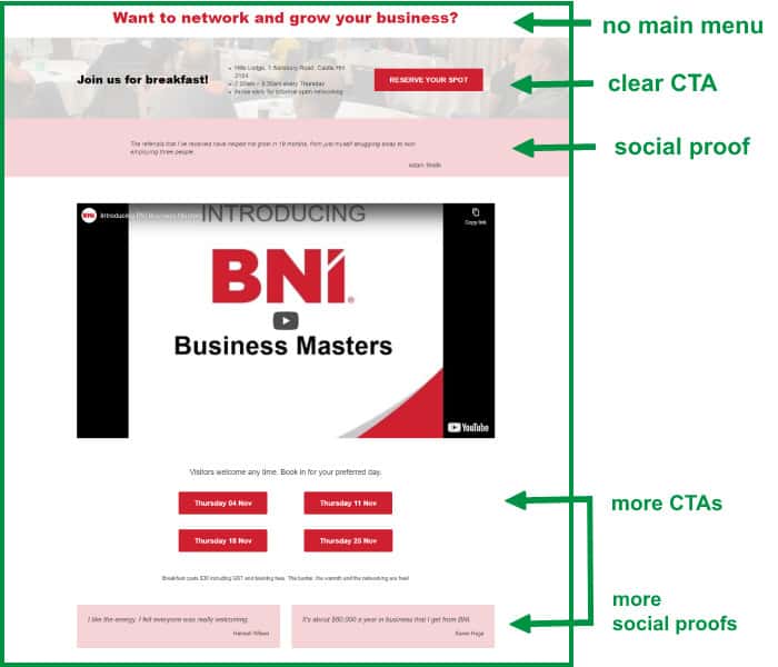
- There is no main menu. The landing page doesn’t want visitors wandering off to look at other pages or other parts of the site. It wants them to stay until they convert.
- It’s not just the main menu. Most landing pages have no links anywhere else. Footers are usually absent or simplified. There may be one small link in the footer for people who just won’t commit without more information, but there may be none.
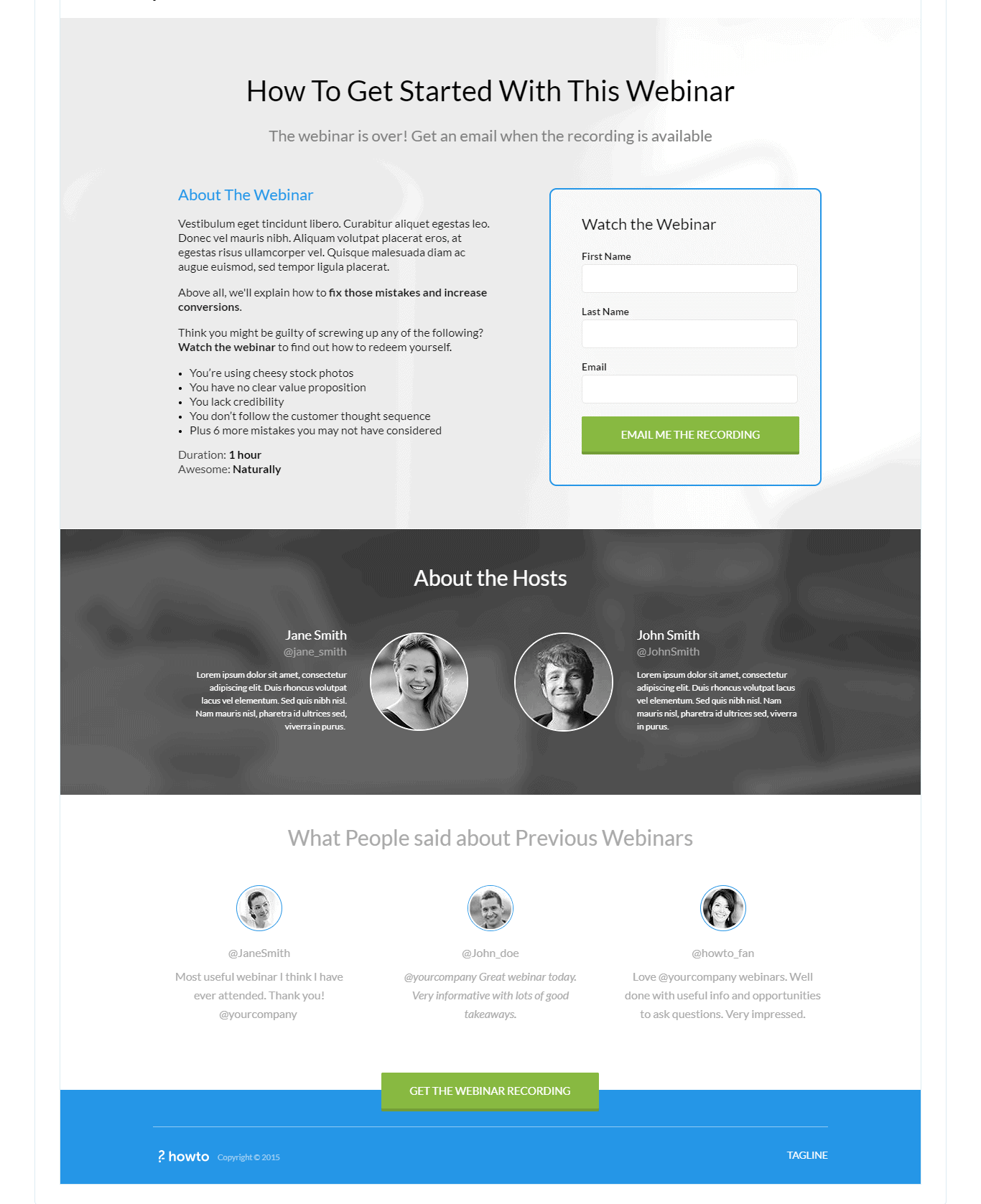
- It always has a clear conversion mechanism. This can be a purchase button, a form, or a call button. Whatever it is, it will be big and obvious.
- The layout can be very different from the standard templates on your website. Usually logos and brand colours are kept the same, but the structure of the page can be very different.
- The landing page may be built in specialist software rather than as a part of your main website.
How do you build landing pages?
There are two main ways to build landing pages:
- You may be able to build them within your own website software. If you’re using WordPress, this means a theme which has a blank template without the menu, header and footer. Otherwise, you need to do some fancy coding to prevent those displaying – not recommended.
- You may prefer to use a specialist ‘landing page builder’ software. The best known are Unbounce, LeadPages and Instapage. Many marketing-focused CRMs (like Hubspot or ZohoOne) and email marketing platforms (like ActiveCampaign or Mailchimp) and marketing software suites (ClickFunnels) also have landing page capability.

Why do people use specialist landing page builders?
The investment in specialist tools is justified because landing pages are important. If you’re spending a lot of money on ads to generate traffic, you want as many of those visitors to convert as possible.
The cost of a landing page builder is minimal compared to your ad spend, but it gives you lots of power and control. You can build pages in any way you want, build as many as you want, test them – all without needing help from a third party.
- All of the specialist providers come with an option to make the page look as if it’s hosted on your domain. That is, the url will include yourdomain.com.
- Most of them are ‘drag and drop’ – you won’t have to code anything, you can just create onscreen.
- Many of them include a template library, which means you can pick a page you like and customise it for your offer and your brand.
- AB testing is also usually included. Since these pages are meant to convert, people tend to measure their performance!
Tips to optimise landing pages
Of course, that power to create a landing page however you want doesn’t necessarily mean you’ll create a good one! There are specialist landing page designers and copywriters who can help – they aren’t always cheap. You may prefer to start from the templates provided, or to search for good landing page examples. But to get you started, here are some basic tips.
So on this page, there are a whole set of things that you want to put in, but there are also some things that you want to take out.
1. Take out the links!
Once someone arrives on your landing page, don’t give them options to go somewhere else. Their only options should be to take your offer or to exit by hitting the back button.
Think of it as herding sheep into a sheep dip. You set up fences to funnel the sheep into the dip, and there are no gaps where they can break out.
Or for a more positive experience, think of a water slide. Once you’re in, there’s only one way out! But at least in this analogy, the customer has fun.


2. Make the call to action obvious
You want visitors to do something. Make that clear to them. A great big ‘BUY NOW’ or ‘SIGN UP’ button. A form (with as few fields as you can get away with – people don’t like long forms). Make it a contrast colour so it stands out. If you have a long page, repeat the call to action. Or have high-contrast cannot-miss buttons they can click to get to the main form.
3. Test on mobile as well as on desktop
Yes, this applies to all pages, but it’s even more important when you’re paying for every single person who visits your page.
4. Include every piece of information people might need to help them decide to sign up.
Your visitors are not going to explore the rest of your site. They’re going to decide right now. So answer all their questions.
- What are you offering? Give them all the detail they might need.
- Is there a cost? How do they pay? Is there a guarantee or money-back offer?
- If you’re promoting an event or a course, make sure the date, time, duration and location are clear.
- Prove to visitors that this is worth doing and that they can trust you. Include testimonials and reviews. Accreditations. Actual results from past clients. Anything you can which demonstrates that you are genuine and that it’s worth signing up.
- Address common objections. If people worry about price, explain the value. ‘Yes, this course costs $1,000, but at the end of it you’ll be qualified to do xxx kind of work at an average hourly rate of $YYY, so you can repay your investment in just ZZ days.‘ If they’re worried it might not work, explain why it will – or include the guarantee – or even better, do both!
- Start with the biggest objection. Once you’ve addressed that, offer visitors a chance to say yes. Then move on to the next objection. Offer them another chance to say yes (a call-to-action) right after that. And so on. Your landing page might get really long – don’t worry about that. Just try it. You can always test a shorter version against it too.
5. Test, test and test again
- Long page vs short page?
- Hero image vs video?
- Copy promoting one benefit vs copy promoting another. (Look good vs feel healthier. Save time vs have a clean house.)
- Form on page vs popup
- Order of copy
One hint about testing – you’ll normally get more helpful results from testing two radically different ideas, rather than just changing the colour of a button. Think big! If something doesn’t work, you don’t have to keep it.
Landing pages are a huge topic in digital marketing. There are thousands of articles and thousands of experts. This post just skims the surface. If you’re going to create lots of landing pages in-house, I recommend you spend some time browsing the web and checking out examples. Not just the blog post compilations either. Go to Google and put in some of the search terms your customers might use. Click on the ads. See what you find. That’s the only way to know what’s happening right now in your specific industry.
And if you find one you think is really good, send me the url! I’d love to see it too.


