There are some pages which exist on almost every website – the home page is one, the contact page is another. Yet while most businesses spend hours agonising about the home page, the ‘contact us’ page is often an afterthought. It’s time to change that.
What’s so important about the contact us page?
For a service business, it’s where much of the lead generation happens.
Most web developers and designer will insist that you need a link to the contact page in your main menu – but then they don’t spend much time thinking about the content. It’s a little contradictory!
So what content do you need?
Tell visitors how to contact you, but don’t stop there. Take this opportunity to reinforce all the reasons why they should contact you.
Start with how to contact you
Let’s start with the basics. Make it as easy as possible for people to contact you.
Add every method of contacting you that your clients and potential clients might want to use. That includes:
A contact form
Forms are great because they capture information and can add it directly to your CRM or other database.
Hints for forms
- Keep them as simple as possible. Collecting additional data may sound good to you, but it reduces the number of people who will actually complete the form.
- If you want (or might want) to personalise communications later, it’s a good idea to store the first name and last name separately. Either have two fields on the form, or use some clever technology to separate the data at the first space.
For some businesses selling to consumers, you may want to skip collecting the last name altogether. - Keep the number of compulsory fields to a minimum. Name, email and possibly company is all most people need. In particular, unless you have a really good reason for collecting a phone number, make it optional!
- Include a free text message field. It’s only courteous to let people tell you what their concern is.
- You can use dropdown options to direct enquiries to different people in your organisation. (That could be offices in different states, lawyers with different specialities or any other rule which makes sense for your organisation.)
- If you get a lot of spam, implement a Captcha on your form.
- Send an autoreply to everyone who completes the form.
Not only do they know the form went through, the reply can also act as a way to record what they communicated to you, and as an opportunity to give more information or set expectations about what happens next. - What happens when the form is submitted? First, you need to make sure the visitor knows the form was sent successfully. Second, you have an opportunity to send them to a new page with the specific information you want them to see next.
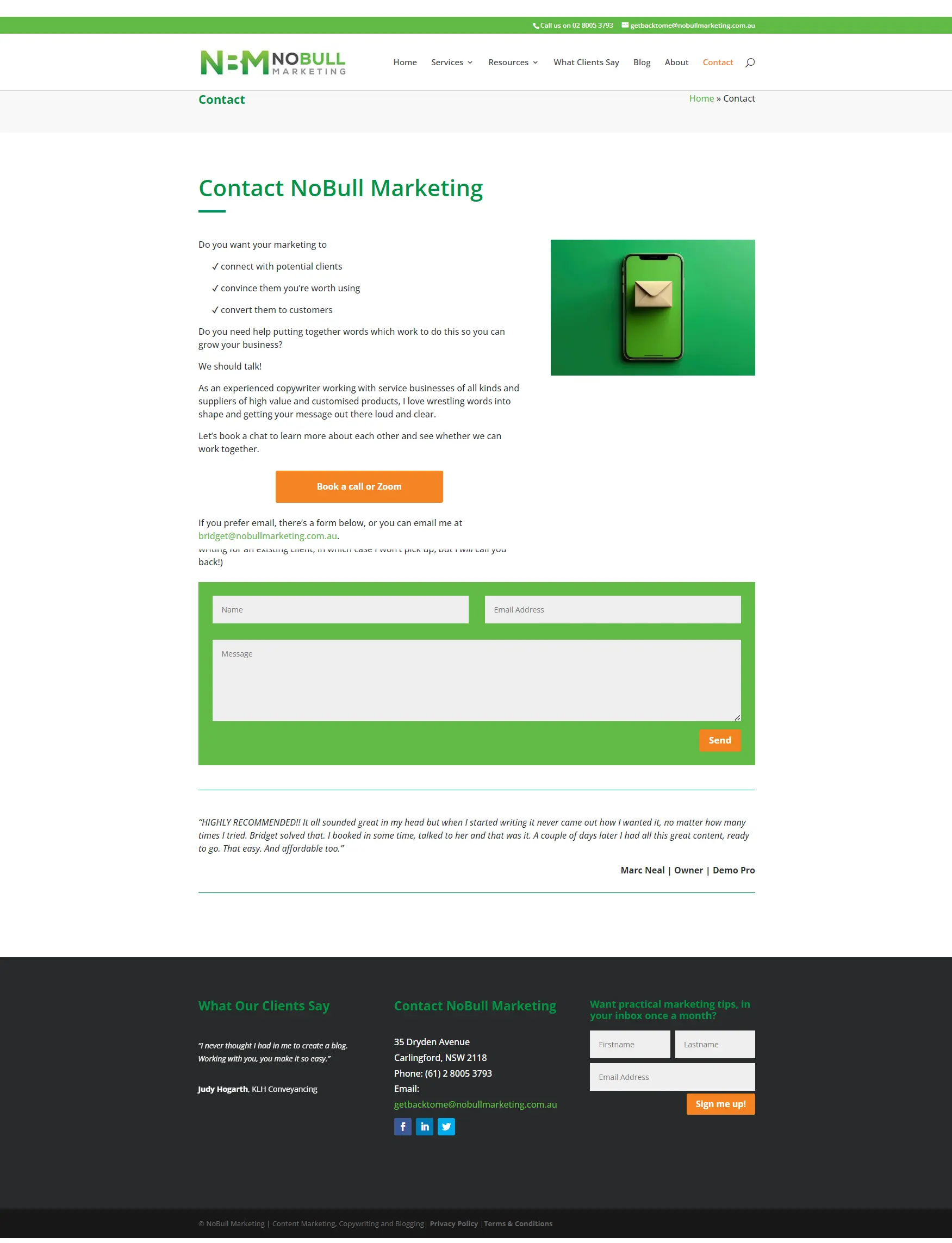
An interesting example of a form is here on the Fortnight Studio contact us page.
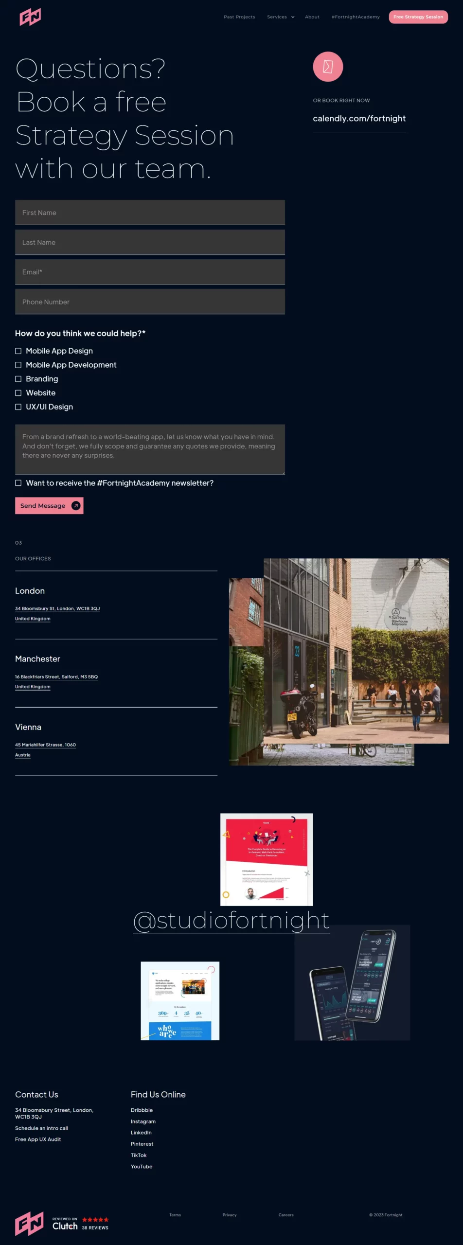
What’s interesting?
- Nice friendly heading, with the offer of a free session included in great big type.
- Neither name field is compulsory, but you do have to tell them what you’re interested in. So they’re trying to give you relevant information, rather than build a database.
- There’s a nice little guarantee / reassurance built right into the form itself.
A phone number
People who call are not just ready to contact you, they’re ready to talk. Make it easy for them!
Also make sure that the phone number you use has a friendly message and that you pick up and respond to any messages people leave.
An email address
Believe it or not, many people have been trained by unresponsive businesses to distrust contact forms. Others just prefer a free-form email.
If the email you use is getting too much spam, remove the link and use a format which makes it easy for people to work out the actual email. For example, bridget[at]nobullmarketing.com.au
You may wish to have more than one email address – for example, if you have different people dealing with accounts, sales and support.
An option to book a meeting
A great way to manage appointment-setting. There might be an option in your CRM suite, or you could use a third-party solution such as Calendly.
Appointment scheduling software is extra useful if you have clients in multiple timezones – everyone will see the meeting in their own time zone. (How many times have you forgotten whether Sydney and Brisbane are on the same time zone right now or not? I’ve done it more than once!)
A physical address
This is a huge positive trust factor!
If you work from home and you’re uncomfortable to share your home address, you can either get a PO box or use a virtual address service.
Maybe you work at client locations and your office is often unattended. You can simply add a line which says ‘By appointment only’ to the physical address.
If you expect to see clients and suppliers at your location as part of your everyday business, include a map or a link to a map so that people can get directions.
Social media links
It’s common practice to include these in the footer of your website. (Some would suggest the header, but personally, I’d rather send traffic from social platforms to the website than the other way around, so I wouldn’t want them to be that prominent.)
If your market like communicating via social media, you may want to include these links again, more prominently, in the body of your contact page.
A chatbot
If you’re going to set up one, set it up on every page. Set it up properly, too. If it’s human-powered, disable it when there’s no one there. If it’s AI-powered, make sure it answers the most common questions and is clear about timelines when it has to refer visitor questions to a human.
Remind visitors why they should contact you.
Now, let’s move on to the content which most people forget.
Even though visitors have got as far as your contact page, that doesn’t mean they’ll necessarily contact you. The page itself is your final chance to convince them to take that step. So make sure you add benefits and social proof.
Use headings effectively
Remind visitors of the problems and issues they’re facing. Remind them of the benefits they’ll get from your service.
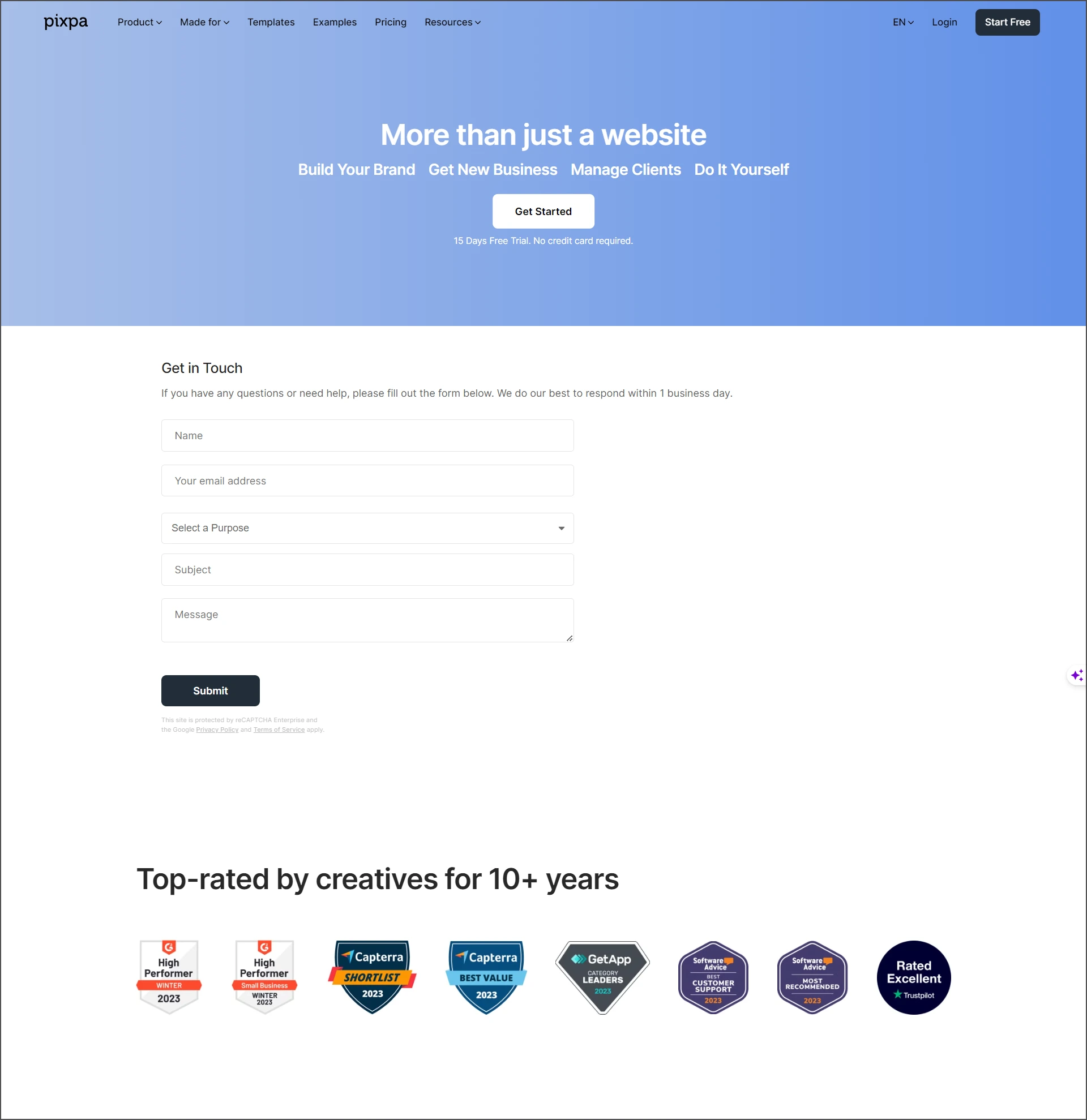
This example from Pixpa is outstanding. Not only does the contact us page promote benefits, it also has a button where visitors can proceed right to trialling the product – shown before the contact form.
Reiterate benefits
There’s no rule which says you can’t have copy on your contact page.
The Narcolepsy Life Academy contact page paints a picture of the difference it could make in someone’s life, and reminds visitors who the site is for as well.
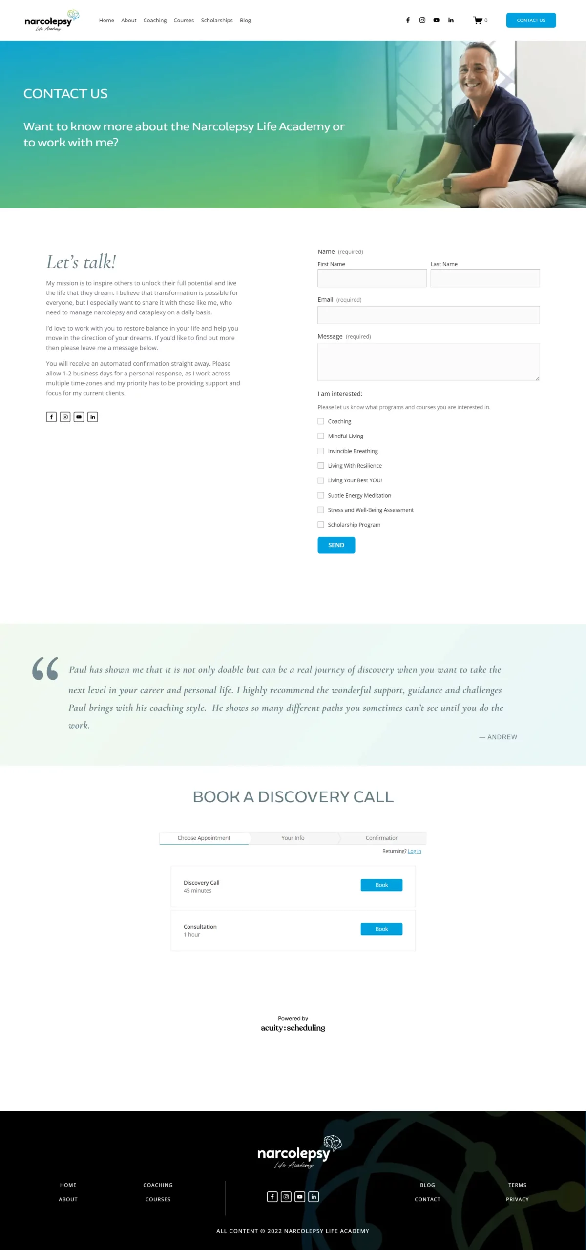
Another nice touch here is the way the copy sets expectations. This is a small business and the owner can’t always follow up straight away, but look how that’s framed. It’s turned from a negative into an example of how he prioritises clients – doesn’t that make you feel he’d be a good person to work with?
Include a testimonial
‘Go on, do it! It’s worth it!’
That’s the message a testimonial gives to the visitor on your page. What better way to overcome those last-minute hesitations and doubts than to add one to your contact page?
That’s why we have one on our contact us page.
Consider other social proof
Awards. Numbers of clients. Memberships.
They’re all ways to give people more confidence in you and your business, so they feel comfortable reaching out.
What about video?
You’ve heard it time and time again – video marketing is effective!
There are two types of video you can consider on your contact page:
- A testimonial
- A message from you as the owner and manager of the business
People buy from people, and they prefer to buy from someone they know, like and trust. You may not be able to achieve all of that via a selfie video, but you can make them feel they know you better and like you more.
Two bonus ideas for your contact us page
Offer a ‘soft landing’ for those who still don’t reach out
Despite all your best efforts, some visitors won’t contact you. But they got this far, so perhaps they’re interested. Why not suggest signing up to your email newsletter? That will give you a chance to keep in touch and build more of a relationship.
Don’t forget SEO
Every page on your website is an opportunity for SEO. While the primary purpose of a contact page is to convert visitors rather than attract them, you can still do some optimisation. This will help your website overall.
Look at this page:
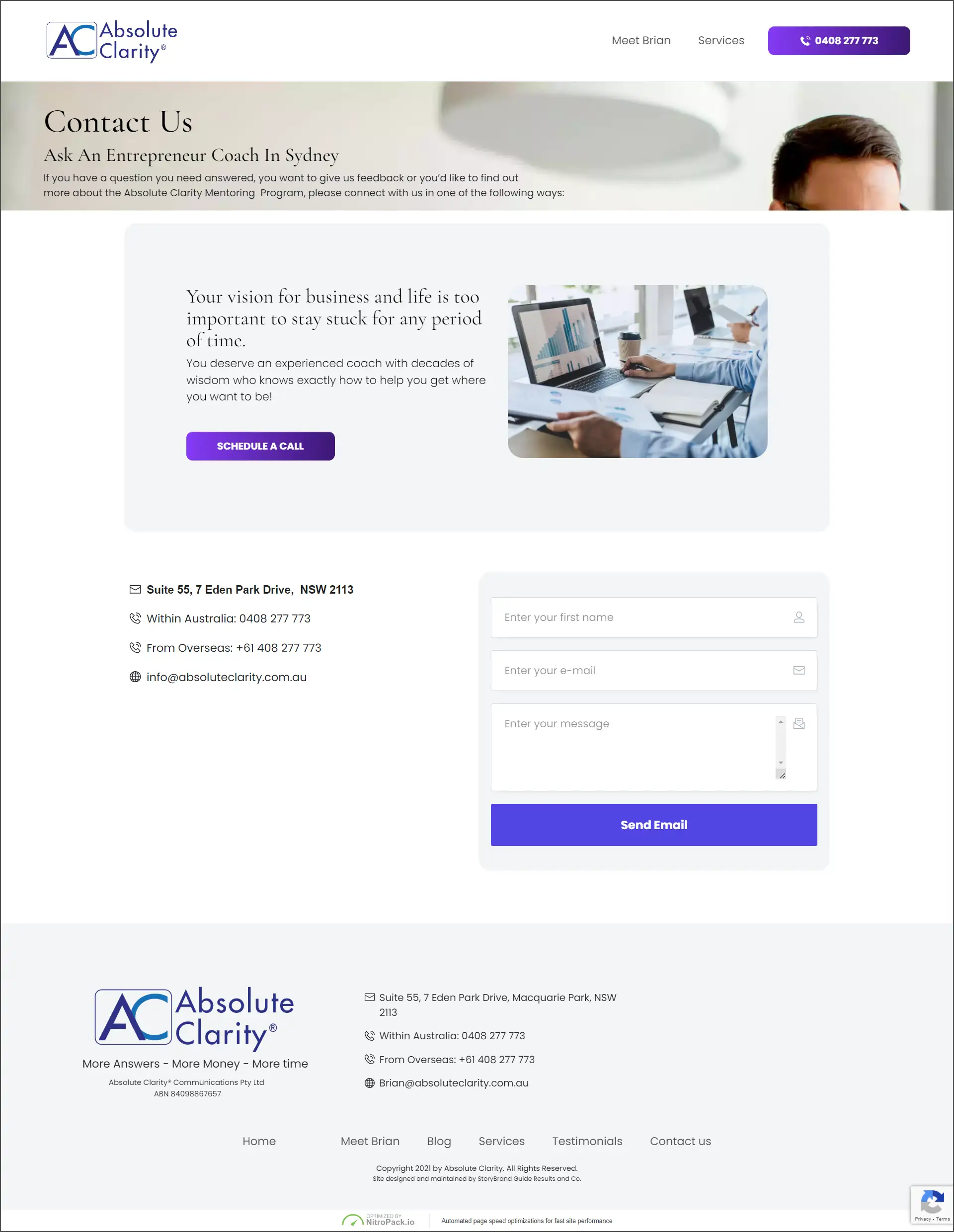
You can see the sub-heading includes keywords relevant to the site overall – ‘entrepreneur coach’ and ‘Sydney’.
As an added tweak, the url for this page is optimised too. It’s absoluteclarity.com.au/contact-us-entrepreneur-coach/
How’s that for clever?
Summing up
As you can see, your contact page can be much more than a form and a phone number.
Take a look at your own page and ask yourself:
- How well does it enable visitors to contact me?
- How well does it encourage visitors to contact me?
If it’s not doing both, it might be time for some tweaks! Use the ideas on this page to chat with your web designer, or if you’d like more extensive copywriting advice, feel free to get in touch!