I’ve written before about readability, but I’ve focused mostly on your copy and getting a good readability score. Today let’s look at other things you can do on your web page to make your already excellent copy more readable. Not the way you use words, but the way you design for readability.
Seven tips to help you design for readability
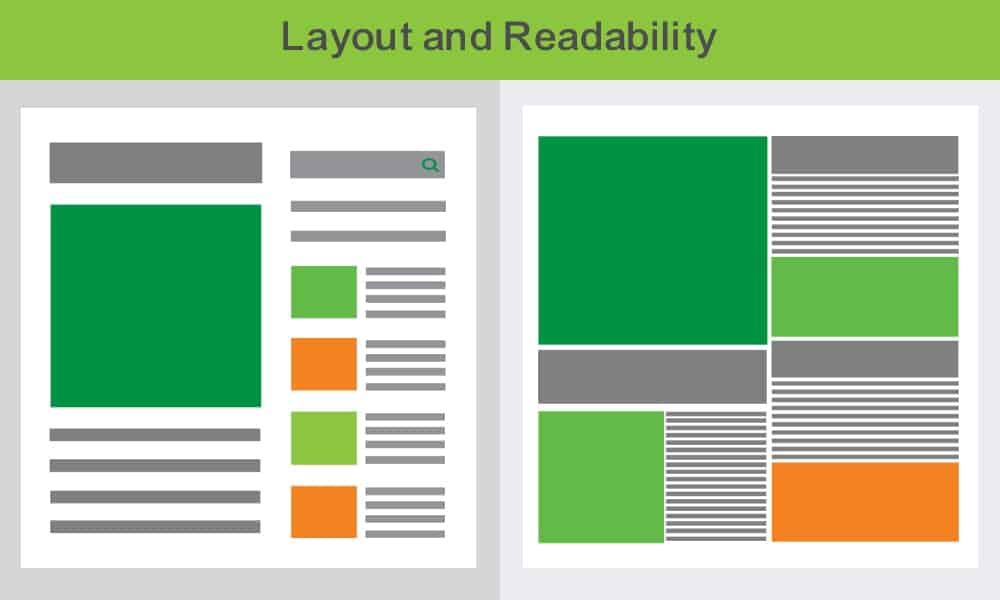
1. White space
White space around your content helps the content stand out. It feels clean and fresh.
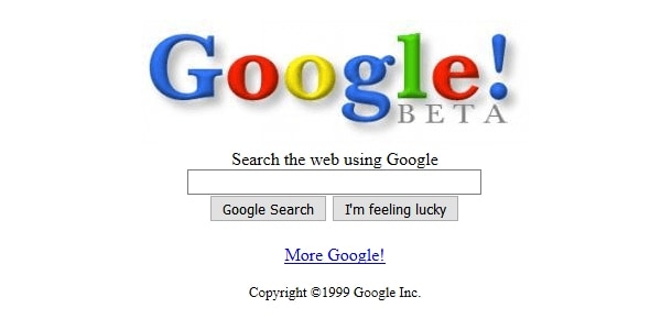
Google launched in 1999. Here’s what it looked like.
Yahoo was a leader in search at that time. Here’s what their home page looked like.
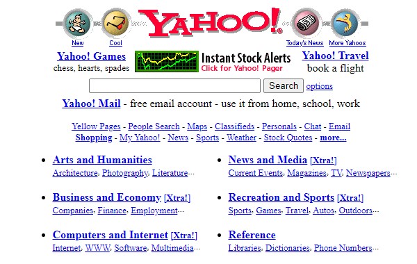
You can see how Google was simply easier on the eye. Of course, better search results helped, but that clean web page was so refreshing way back then…
(These page shots came from the Wayback Machine. Use it check out what other sites used to look like – even your own!)
White space within your content also helps. It breaks things up visually and gives the eye a rest.
2. Headings and short paragraphs
One way to get white space is by spreading the text out.
Start by having short paragraphs – and at least some short sentences too. A good target to aim for is between one and four lines per paragraph – but make sure you have some variation as well.
Headings are another way to break out text. They usually stand out because they’re a different size, colour or font.
Headings break your copy up into scannable chunks. For example, in this blog it’s easy to see what I’m talking about in each tip. So you can get straight to what you want to know.
3. Bullet points
Bullet points also make specific content stand out.
Just make sure you
- Have white space between your bullet points so they don’t run on.
- Use capitals consistently.
- Have consistent punctuation.
4. Font size
The standard font size for websites has become bigger over time. Screens can be tiring, and we don’t want to squint.
The recommended minimum font size nowadays is 14 to 16 pixels.
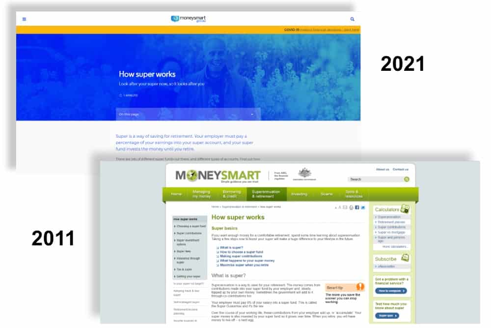
Check out how the MoneySmart ‘How Super Works’ page has changed in the last ten years. You can see both more white space and bigger font.
Interestingly, books also have larger fonts than they used to. In fact, my children won’t even read my old children’s books. They say the print is too small and too squashed up.
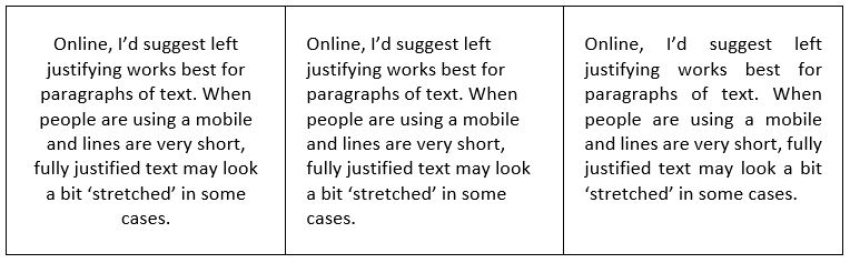
5. Justification
When you read a lot of text, it’s easier on the eyes if every line starts at the same place. You know how far you have to shift your gaze to find the start of the next line.
In recent years though, many websites have started to include long paragraphs of centred text. Why? It’s harder to read. Your eye has to jump all over the place to find the start of each line.
By all means, centre your headings. Centre justify two to three lines of copy if you have to. But for more than that, left justify or centre justify.
6. Line length
Now for something which happens not on mobile, but on large screens. The screen gets too wide for the eye to read comfortably. You start reading from the left and you might have to move your eyes. You may even have to turn your head to read to the right hand side of the screen. Now going back to the left and locking onto the very next line becomes harder.
So set a maximum line length and just have white space on either side so that your content is beautifully presented.
The recommended line length is something like 45-75 characters. And confession time – we’re not currently following that rule on our site! But changes are on the way…
7. Images
Images help your copy readability in so many ways.
- They provide variety. In long copy, they give the reader a moment to rest.
- They can evoke emotions more quickly than the copy will.
- Sometimes diagrams explain some points far more clearly than text can.
- Charts and statistics can draw attention to key information.
A good rule of thumb is to have an image for every 150-200 words. We don’t always achieve that, but we try.
Some more tips about images and readability:
- Don’t cram your images in. Have some white space around them.
- Captions are read more than body text and can be very effective at drawing attention. But make sure your captions are easily distinguished from your body text.
- If you don’t have and can’t find any suitable images, consider using text boxes with a contrasting background colour – or quotation formats – to make some parts of your text move visual.
As you can tell from the above, the NoBull Marketing website doesn’t have a perfect design for readability. Like every website out there, it has room to improve. We’re adding all these issues to our checklist and you’ll see some changes in coming months!
Why not take a look at your site and see if there’s anything you could change?